
Graphical Representation of Mass Variations
Graphical representations are aimed at providing easy analysis possibilities as well as providing more complete information than the numerical estimates. The following graphical representations are common with the latest generation evenness testers.
Spectrogram
3D Spectrogram
Variance Length Curve
3D Variance Length Curve
Normal Diagram
Cut Length Diagram
Histogram
Spectrogram
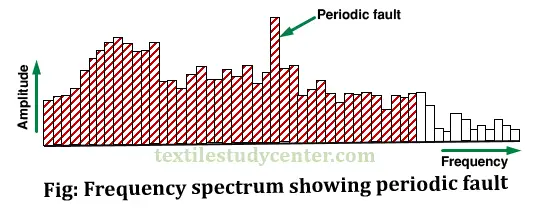
The numerical values such as U% or CV% are not influenced by the periodic variations. A spectrogram is used to measure the periodic or nearly periodic mass variations in a sliver, roving and yarn by analyzing the frequencies at which faults occur electronically.
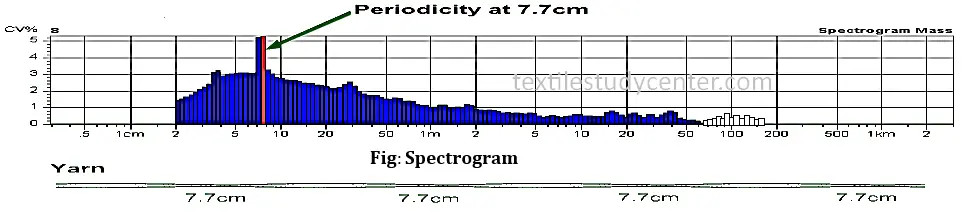
The spectrogram (or spectrograph) is a graphical representation specifically designed for identification and analysis of the periodic faults. It is a representation of the mass variations in the frequency domain. In other words, a spectrogram shows how many times a mass variation repeats itself in a tested length of yarn. The figure shows an example of the spectrogram for a yarn.
The wavelength of a spectrogram directly indicates the distance over which the periodic fault repeats. Frequency and wavelength are related as follows
Arrangement of Spectrogram
►In a spectrogram, the X-axis represents the wavelengths and Y-axis represents the amplitude of the faults as shown in Figure. Often a logarithmic scale is given for the X-axis to cover the maximum range of wavelengths.
►The spectrogram consists of shaded and non-shaded areas. If a periodic fault passes through the measuring head for a minimum of 25 times, then it is considered as significant which is displayed by shaded area. When a fault repeats for about 6 to 25 times within the tests length of the material, then it is considered as unessential which is displayed by non-shaded area. Faults which occur less than 6 times will not appear in the spectrogram.
►A spectrogram starts at 1.1 cm if the testing speed is 25 to 200 m/min. It starts at 2.0cm if the testing speed is 400 m/min and it starts at 4 cm if the speed is 800 m/min. For spun material the maximum wavelength range is 1.28 km.
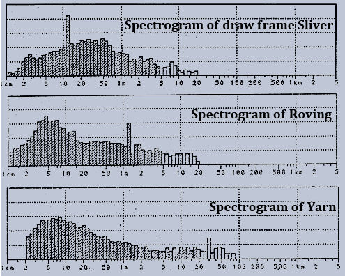
►Wavelength range covered by an evenness tester depends on the test speed and the evaluation time. With staple fiber yarns it covers a wavelength range 2 cm to 1280m and with filament yarns a range of 2 cm to 2560m.
►In the following spectrogram, periodic fault is shown at 7.7cm wavelength
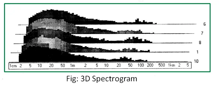
3D Spectrogram
This 3D spectrogram may be used to identify whether the fault is present in a single output/delivery or common to all samples. If the samples are from the same machine and all the spectrograms indicate the same fault, then it can be concluded that the fault is due to a common problem such as main drive elements.
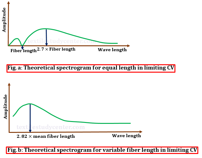
Theoretical spectrogram
If the CV of a yarn is zero then the spectrogram consists of a straight line. If the yarn has a completely random distribution of staple fibers, the staple length L has an effect on the spectrogram.
Case 1: The spectrogram of a fault free yarn consisting of all fibers with equal length (e.g. staple fiber yarn) will be as shown in Fig.a. It will be started at zero point corresponding to the staple length and a maximum value at 2.7 times the staple length.
Case 2: The spectrogram of a fault free yarn consisting of natural or variable length fibers will be as shown in Fig.b. In this spectrogram, the maximum amplitude lies at a wavelength of 2.82 x Mean fiber length.
Spectrogram with common periodic faults
Mainly two types of periodic faults are shown in the spectrogram. They are-
►1. Hill type faults
►2. Chimney type faults
Hill type faults
A hill type fault, where several adjacent peaks are noticed, is normally due to drafting waves caused by factors such as improper draft zone settings, improper top roller pressure, too many short fibers in the material, etc.
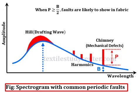
Chimney type faults
A chimney type fault, consisting of one or more ‘peaks’ or ‘chimneys’, is normally due to a mechanical fault such as eccentric roller/gear, improper meshing, missing gear teeth, missing teeth in the timing belts, damaged bearings, etc.
If the height of the peak (P) above the basic spectrogram at any wavelength equals or oversteps by 50% of the height of the basic spectrum at that wavelength i.e. P≥B/2, then it can be considered to be sufficiently serious fault.
Causes of periodic fault in fiber assembly
►Drafting waves are responsible for periodic faults. Drafting waves caused by factors such as improper draft zone settings, improper top roller pressure, too many short fibers in the material, etc. These produce chimney type fault/spectrogram.
► Mechanical fault such as eccentric roller/gear, oval shape roller, improper meshing, missing gear teeth, missing teeth in the timing belts, damaged bearings, defective apron, etc. are responsible for periodic faults. These mechanical faults produce chimney type fault/spectrogram.
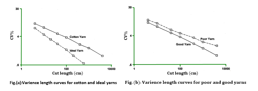
Variance Length Curve
The variance length curve is a graphical representation of the coefficient of variation value CV for various cut lengths. It is produced by calculating the CV for different cut lengths and plotting it against the cut length on log-log paper. A perfect yarn would produce a straight line plot. A curve is a useful tool for examining long-term non-periodic variations in a yarn. The better is the evenness of the yarn the lower is the curve and the steeper is the angle it makes with the cut length axis. This is shown in Fig.(a), where the variance length curve for an actual cotton yarn is compared with a curve for an ideal yarn. The measured curve deviates from the theoretical curve in the region where there is long-term variation in the yarn. The variance length curve of a poor fiber assembly lies above the curve of a good fiber assembly as is shown in Fig.(b), where the poor yarn diverges from the good yarn at the longer cut lengths.
Normal Diagram
The Normal Diagram represents a graphical plot of the basic mass variations of the textile material over its length. The reference length for the mass values is the basic measured length of 1cm.
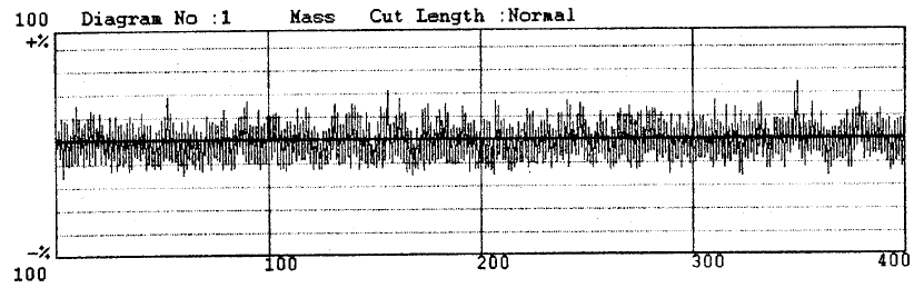
The diagram provides additional information on the mass variations which cannot be obtained with other forms of representation – either numerical or graphical. The following are some of the information which can be usefully applied for process control.
→both periodic and non-periodic variation in the material
→extreme thick places / thin places
→slow changes in the mean value
→step changes in the mean value
Cut Length Diagram
The cut length diagram is a graphical representation similar to a normal diagram but represents mass variations over specified cut lengths like 1,3,10, 100m etc. The variations over lengths lesser than the cut length of the diagram are suppressed.
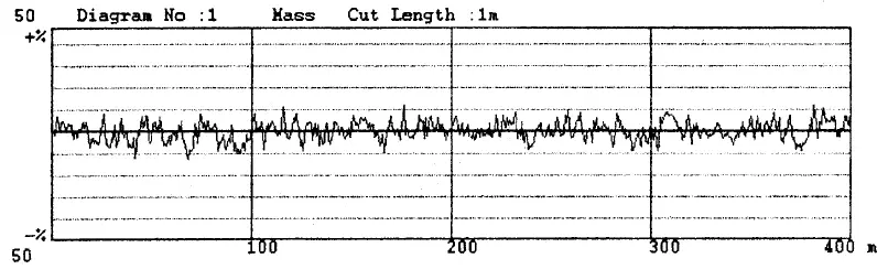
With the help of diagrams of different cut lengths, the following information can be obtained:
→Checking of the functioning of auto leveler fitted draw frames.
→Checking of count variation (with cut length 100m).
→Setting of the sensitivity of the count channel in the latest generation Yarn Clearers.
Histogram
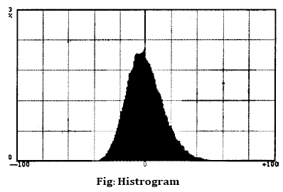
A frequency distribution diagram of the mass variation in yarns, rovings and slivers, from which one can identify whether the overall thick and thin places are evenly distributed in the material. For an evenly distributed material, the shape of the curve should be a bell shaped one.
(0)
Graphical Representation of Mass Variations


0 comments:
Post a Comment